Spring Health
2 Week Experiment
Onboarding · Activation

Turning
failure into
a framework

TL;DR

A failed hypothesis test on Spring Health's benefit-activation flow led to a 9% lift in account creation, and a reusable pattern for showing members what they're actually getting.

Onboarding framework, project cover
+9.3% Lift in account creation
over control
77.6% Final variant
account creation rate
2 Weeks From hypothesis
to shipped result

My role

Design, research, and experiment strategy, end to end

Approach

Hypothesis test → moderated research → redesign → retest, inside a two-week window

Outcome

9.3% lift in account creation, and a modular benefit-card pattern now usable across coverage types
The hypothesis

Showing the benefit first seemed obvious. The data disagreed.

The theory was simple: if members could see exactly what they were signing up for before creating an account, more of them would follow through. I designed a variant that surfaced full benefit details, sessions, coverage type, who was sponsoring it, right at the top of the registration screen, ahead of any account fields.

Two weeks live, and the result ran counter to the hypothesis. Leading with clarity didn't convert better. It converted worse.

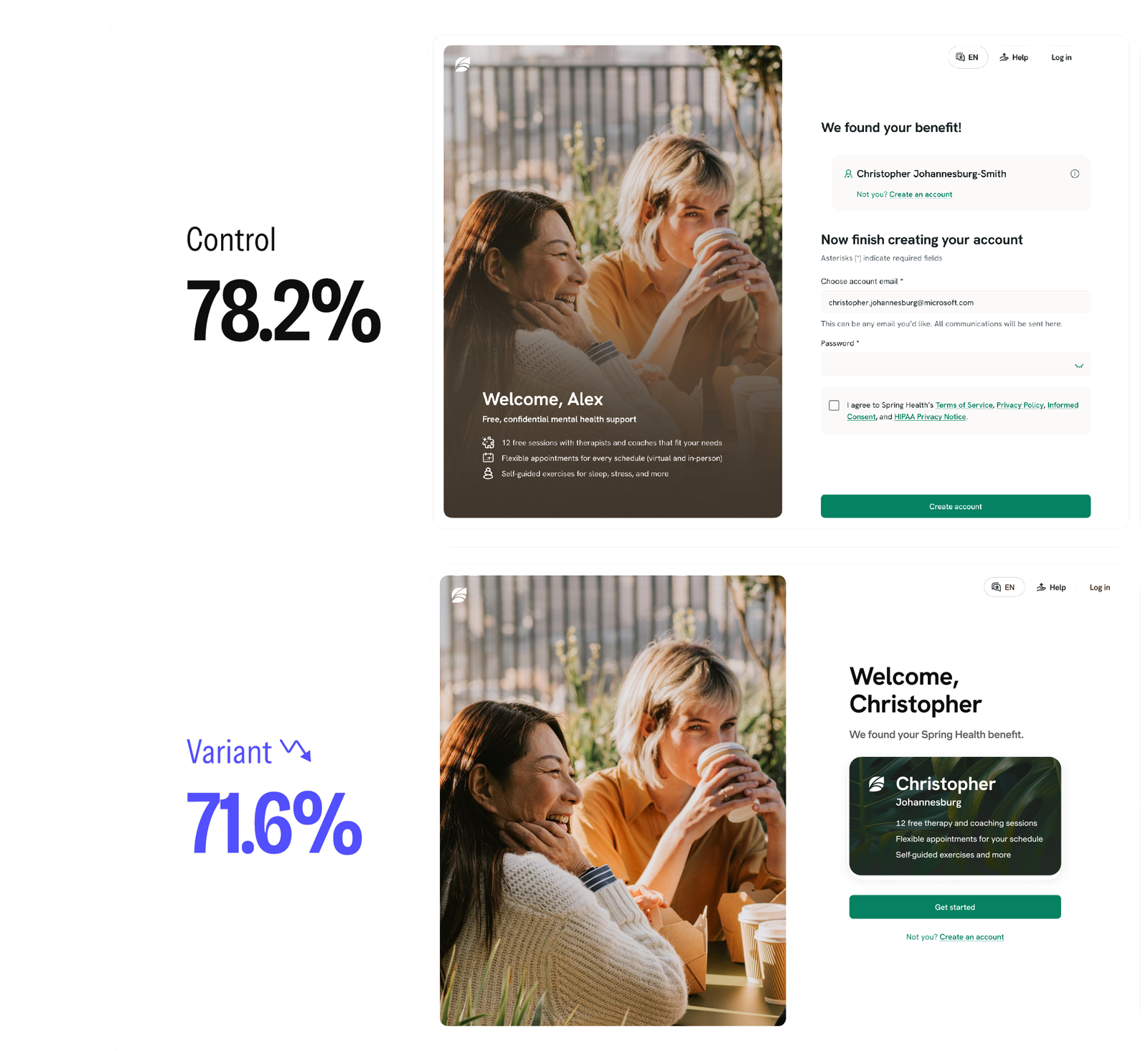
Control

78.2%

Account creation rate. Benefit details shown after the member starts creating an account.

Variant

71.6%

Account creation rate. Benefit details shown up front, as a separate step before sign-up.

Control and variant screens from the original hypothesis test

Control (top): benefit shown after account creation begins. Variant (bottom): benefit shown as a dedicated step first — a 6.6% drop in account creation.

Diagnosis

The design didn't fail. The sequencing did.

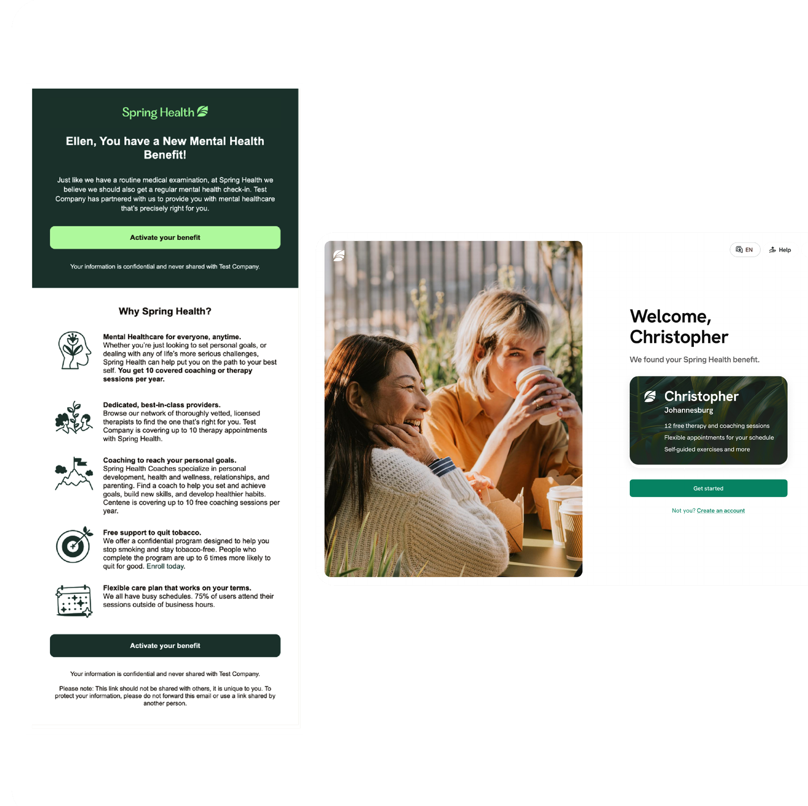
More information wasn't the problem, an extra step was. Front-loading benefit details pushed the actual sign-up further down the page, adding friction between a member's intent and the action that mattered. I traced the same gap back through the rest of the entry flow, from the original activation email through the welcome screen, and found it almost everywhere: plenty of copy about what Spring Health offers in general, but nothing telling a specific member, in plain terms, what they were actually getting.

Original activation email and welcome screen

The existing activation email and welcome screen: broad benefit messaging, but no clear answer to "what do I actually get?"

Research

Members were creating accounts without understanding what they'd get.

I ran a short round of moderated usability sessions across both versions of the flow. Across sessions, the same moment of confusion kept showing up right at account creation: members were willing to sign up, but weren't confident about what they were signing up for.

Once I got to the account setup, I realized I still didn't really know what my Spring Health benefit actually included. Was I getting therapy? Coaching? Both? I ended up creating my account, but wasn't confident about what I was actually signing up for.

— Spring Health member

Reframing the problem

Benefit clarity isn't a single moment. It resurfaces the whole way through.

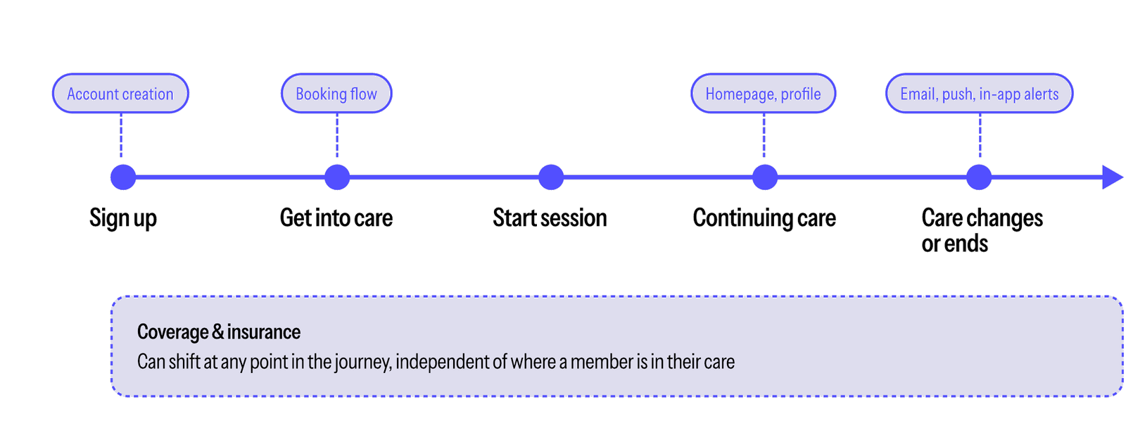
Rather than treat this as an account-creation problem alone, I mapped where benefit information needed to show up across the full member journey, sign up, get into care, start a session, continuing care, and when care changes or ends, plus coverage and insurance, which can shift at any point independent of where a member is in their care. That reframing is what turned one failed test into a system worth building for.

Member journey timeline showing where benefit clarity needs to resurface

Mapping the member journey: benefit and coverage information needs to resurface at every one of these moments, not just at sign-up.

The solution

A modular benefit card, designed to flex.

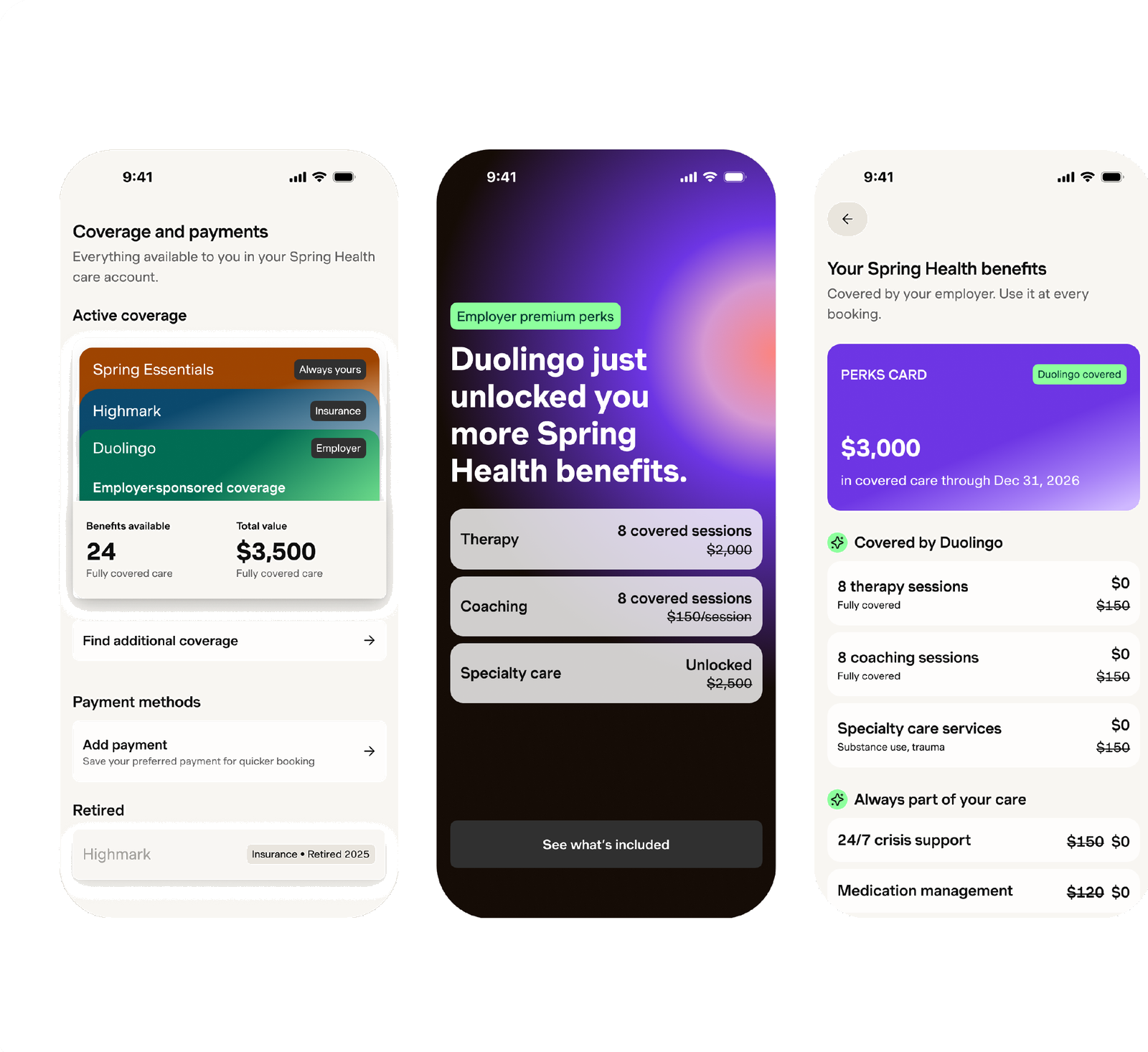
Working from that map, I designed a benefit card component that could adapt to any coverage situation, insurance, employer-sponsored care, or a third-party perk like a Duolingo-covered benefit, while always answering the same question first: what does this member actually get, and what does it cost them. The same pattern needed to hold up whether someone had one type of coverage or several stacked together.

Three phone screens showing the flexible benefit card system

Visionary designs created in close collaboration with our benefit designer — the same card pattern applied across three different coverage contexts: full account overview, an unlocked employer perk, and a benefits summary.

Iteration

Testing the edges before committing to one version.

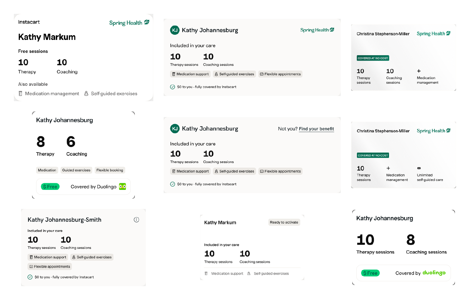
Coverage data is messy: free sessions, partial coverage, expired benefits, multiple overlapping sponsors. I explored a wide range of card states to find a format that held up across the messiest real-world combinations, then narrowed to a version simple enough to build and test inside the two-week window.

Grid of benefit card variations explored during scoping

A sample of the card states explored, stress-testing the format against different names, coverage types, and session counts before narrowing scope.

The redesign

One card. The benefit and the ask, together.

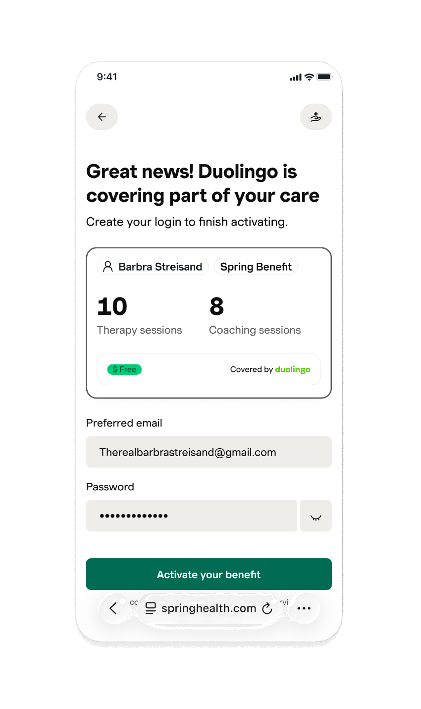
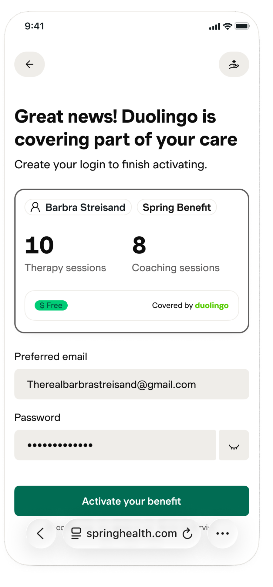
The redesigned variant paired a compact benefit summary, sessions included, who's covering it, and at what cost, directly above the account fields, instead of ahead of them as a separate step. Members could see exactly what they were getting without adding a screen to the flow.

Final redesigned activation screen

The final screen: benefit summary and account creation combined into a single step.

From a 6% loss to a 9% lift.

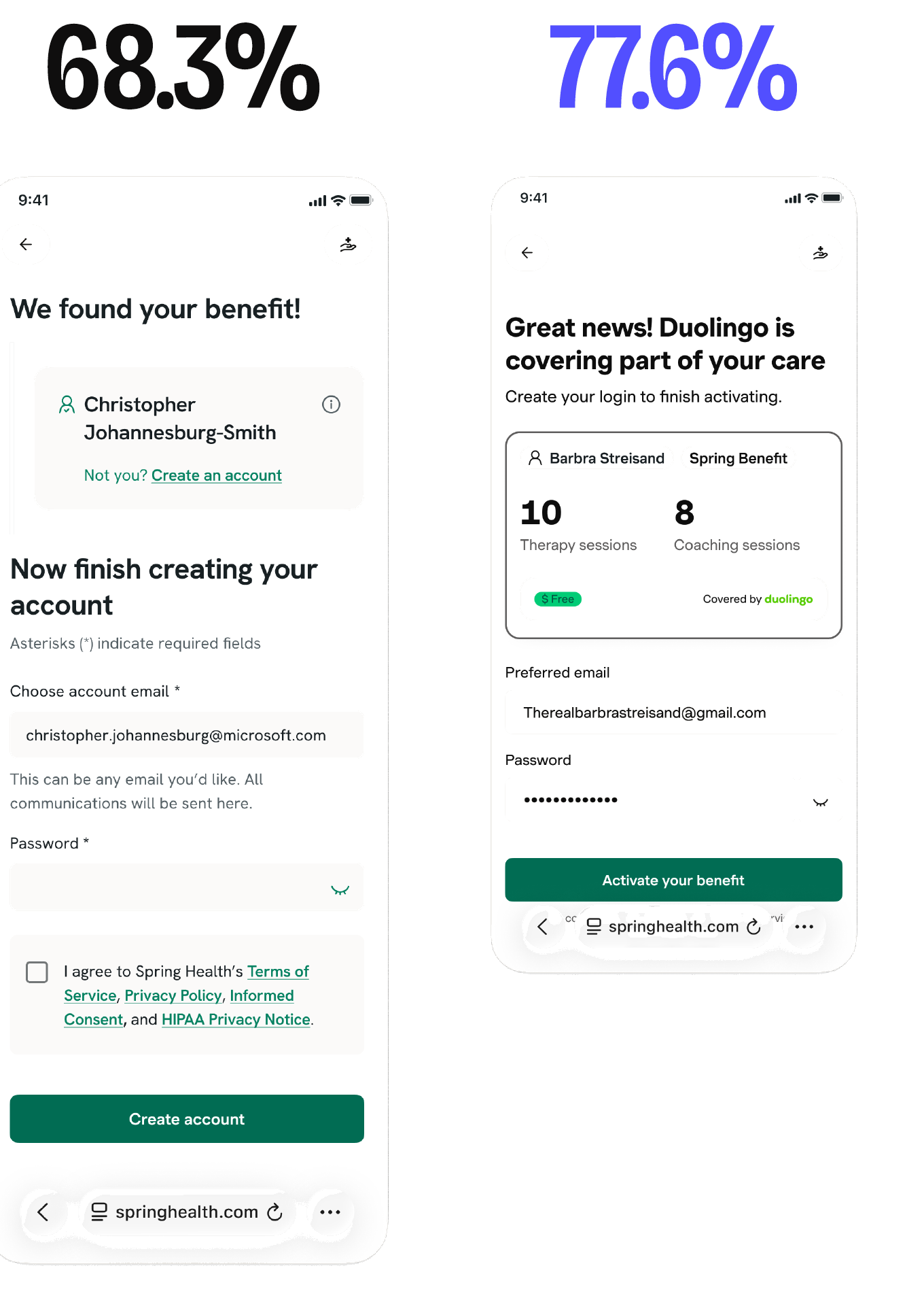
Retested with the redesigned flow live for two weeks. Where the clarity-first variant had underperformed control by 6.6%, the redesigned version outperformed a ~68% control by 9.3%, evidence that leading with clarity was the right instinct. The first execution had just buried it in the wrong place.

68.3% Control, retest
77.6% Variant, redesigned
+9.3% Lift
over control
2 Weeks, hypothesis
to result
Final A/B test results, control versus redesigned variant

Control vs. the redesigned variant in the retest — the benefit card now sits directly above account creation instead of ahead of it.

Looking at what's next

A pattern other teams can build on.

The card format is now a reference pattern other teams can adapt for their own coverage and eligibility surfaces, not a one-off screen. Multi-eligibility work, handling members with several forms of coverage stacked together, picks up from here.

  • Designed and shipped two full experiment variants inside a two-week window
  • Ran moderated research to diagnose why the first variant underperformed
  • Mapped where benefit clarity needed to resurface across the full member journey
  • Built a modular benefit-card pattern adopted as a reusable framework

Next project

Turo Navigation Redesign

→