My role
Lead Product Designer — research, IA, design execution, design systems
Timeline
1 month
Outcome
Task success rate from 3% to 91%; new navigation pattern adopted into Turo's design system
The challenge
During user testing, UX researchers uncovered a critical issue: 97% of participants failed to locate the start time of their current reservation on mobile. Trip management is central to the Turo experience — it's the moment guests most need clarity and confidence.
The existing navigation was creating friction at exactly the wrong time, leading to support tickets, frustration, and a fundamental breakdown in trust with the product.
"97% of participants failed to locate the start time of their current reservation on mobile."
The approach
I partnered closely with UX researchers to analyze the testing results, map behavioral failure points, and understand the mental models guests were bringing to the app. The problem wasn't one surface — it was a systemic IA issue that had compounded over time.
From there, I moved through multiple navigation frameworks at low-to-high fidelity, assessing each against the core usability goals: make Trips immediately findable, and make every navigation element self-explanatory without needing exploration.
Cross-functional working sessions with product, engineering, content, and the Design Systems team ensured the solution was both technically feasible and extensible — the new patterns would need to scale beyond this feature and become part of Turo's broader design language.
Follow-up usability tests validated the redesign before launch, confirming both quantitative improvement in task success and qualitative shifts in how guests talked about the app.
Before & after
Both views show the same Turo car search results page — the moment a guest is deciding whether to book. The only change is the navigation bar at the bottom. Before, tab labels were ambiguous and icons were inconsistent, leaving guests unsure where their trip lived. After the redesign, each icon is immediately self-explanatory and task-oriented.
Before
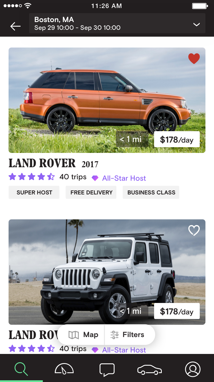
Old navigation — inconsistent icons and ambiguous labels caused 97% of guests to miss the Trips tab entirely.
After
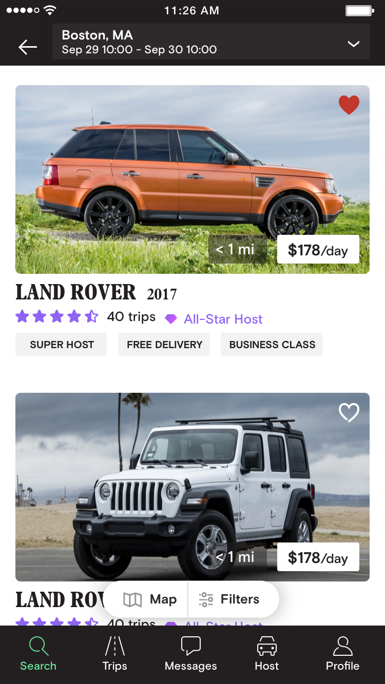
Redesigned navigation — clearer iconography and updated hierarchy made trip management immediately findable.
Design process
The redesign required evaluating dozens of icon directions — Search, Trips, Messages, Host, and Profile each went through multiple rounds of exploration. The spec sheet below captures the full progression: initial icon audit, updated Search/Messages/Profile icons, deep Trips icon explorations (from literal roads to abstract motion), and Host icon alternatives tested for clarity with new and experienced hosts alike.
Full navigation icon spec — documenting the audit, explorations, before/after screens, and final icon system adopted into Turo's design system.
Impact
The redesign resolved the immediate usability crisis while establishing a scalable navigation foundation adopted into Turo's design system. Beyond the headline metric, every downstream signal moved in the right direction — fewer errors, fewer support needs, higher confidence.
87% of guests in follow-up testing described the navigation as "clear" or "very clear" — a phrase that almost never appeared in pre-launch research.